Silver Communion Balloon and Turquoise Tablecloth © Jonathan Blaustein
I first became familiar with Jonathan Blaustein’s work in 2009 when we met at Center Santa Fe’s portfolio review. While I was first excited by our comically similar names, his series The Value of a Dollar grabbed me for its direct stripping-down of food as a commodity, a source of nourishment and symbol of wealth, power, health, and inequality in the 21st century.
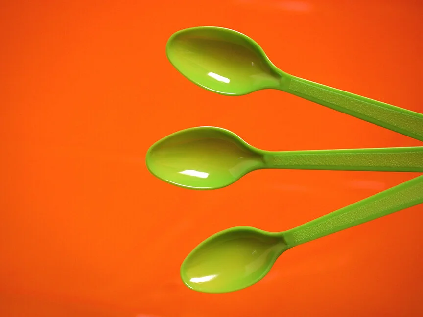
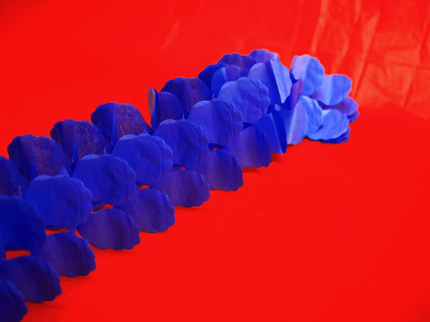
For more than a decade, and across multiple series, Blaustein has mixed this deadpan simplicity with bits of humor and earnestness to critique, poke fun at, and highlight the impact of consumerism and throwaway culture on the environment and society at large. His latest series Party City is the Devil continues this trajectory with garishly bright, poppy, typology-meets-Warhol inspired photographs. Red mime masks, cardboard crowns, shoddily-inflated ballons, and other useless party gags sit on disposable-tablecloths-turned-studio-backdrops. Using available light to mimic their no-frills essence, Blaustein’s photographs make bare the absurdity of the most disposable cultural items – the plastic crap we so readily buy and toss from stores like Party City.
I spoke with Blaustein, smack in the middle of his Kickstarter campaign to fund Extinction Party, a photobook culminating Blaustein's many projects, which Yoffy Press will (if you, dear readers, help fund it) publish in 2020.
Jon Feinstein in conversation with Jonathan Blaustein
Red Mask with Blue Gumballs © Jonathan Blaustein
Jon Feinstein: I'm going to start off, I'm going to shamelessly plug your upcoming book because, hey - these interviews are supposed to help artists move their careers forward, and what's better than no-bones-about it cutting to the chase. You just launched a Kickstarter for Extinction Party. Why should our readers support it?
Jonathan Blaustein: That's a good question, and one I've asked myself, as running a Kickstarter campaign has always intimidated me. Thankfully, as an artist and a writer, I've developed an audience over the years, as some people seem to like what I have to say. So I decided that if I was going to ask the community to support a book, it had better be the best I can accomplish.
Given my amazing team, with editor/publisher Jennifer Yoffy, designer Caleb Cain Marcus, and essay author Kevin Kwan, who wrote the "Crazy Rich Asians" trilogy, I think we made something special.
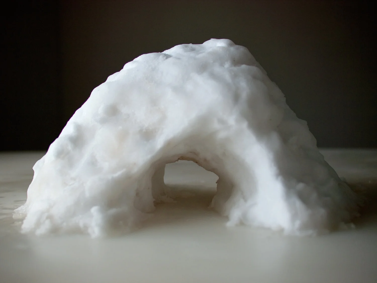
"Extinction Party" features art made out of snow and ice, trees and rocks, plastic and candy, cows and pigs. It shows, definitively, how our Capitalist society transforms natural resources and living creatures into food, plastic and rapidly accumulating trash.
I also wrote a few original stories, so the book has my writing too.
Silver Blue Crown and Red Tablecloth © Jonathan Blaustein
Purple Pop Rocks and Exposed Photo Paper © Jonathan Blaustein
Feinstein: The title "Extinction Party," like your recent series "Party city is The Devil" is blunt, direct, full of dark humor.
Blaustein: Well, the subject of the book, (as well as "Party City is the Devil") is the idea that human beings, through our consumption addiction, might be rendering our planet uninhabitable.
(In a frog-in-boiling-pot-of-water kind of way.)
In the media, we see predictions about the end of the world, the disappearance of species, and the mass slaughter of animals for our food supply. These are the bleakest of subjects, and I think humor is a smart, decent response such misery. (In the old sense that if you don't laugh, you cry.)
I've been influenced by cinema and popular culture, and like to include a streak of absurdism in my art, both to make it engaging, and because it's my natural response to the world.
"Party City is the Devil" was actually named after a bit in a Seinfeld episode, in which Kathy Griffin, doing a full-meta performance, writes a one-woman show called "Jerry Seinfeld is the Devil." So between that reference, and Prince's "1999," I thought "Extinction Party" hit the right notes. If we're going down with the ship, at least we'll have our streamers and tinsel and shiny plastic goodies.
Green Spoons and Orange Tablecloth
Feinstein: This book and your work in general calls out the problems with, and absurdities around consumer culture. It's somehow funny and heartbreaking. What's your thought process on this and how were you first drawn to tackle these issues visually?
Blaustein: Well, sorry I beat you to the word absurd above, but I appreciate your other adjectives: honest and heartbreaking. You're too kind. I'd never done much studio work before "The Value of a Dollar." And I'd never photographed objects before, either, which is kind of surprising.
I studied conceptual art at Pratt, so the idea of shopping as my process, and creating a language of equivalence among things that had the same economic value, those ideas led me to my current style.
Visually, it was all driven by advertising photography. Back in 2008, I wanted to make a photo of a McDonalds' double-cheeseburger that would exist as a real-world counterpoint to the perfectly manicured, fake burger that lives on billboards, and on the side of semi-trucks.
Feinstein: Many of your projects take a straightforward typological approach. I'm thinking of this and Value of A Dollar. Why is this important to illustrate the concepts at hand?
Blaustein: I'll admit right off the bat that I was heavily influenced by Andy Warhol, John Baldessari and the Bechers. Each played with repetition within their visual strategies.
Typologies allow for repeated engagement, which works for two reasons. Patterns are great, compositionally, and working out ideas through repetition helps solidify those ideas, until we get bored.
Really, though, it's about isolating something. I've always wanted to say, "Hey, look at this. It's important, because it represents ideas that are leading to our collective ruin." And if you isolate something, and decontextualize it, and repeat the process, then the resulting pattern is a typology.
Blue Streamers and Red Tablecloth © Jonathan Blaustein
Feinstein: That being said, I'm curious about the way you volley between the subdued color palette of Value of a Dollar and the bright, garish yet enticing color palette of Party City is the Devil....
Blaustein: I gave a talk last year at UNM in Albuquerque, and it was about my work since the Great Recession. Basically, it was the material that led to this book, but I showed everything sequentially. You could see how the color slowly amped up over time, as the original images were fully celluloid, in aesthetic, even though they were shot digitally.
"MINE," the next project, included some strobe, so a few of those images had a heightened saturation. And then "Recycling my Junk," in which I shot my studio trash, included some bigger primary color use, and the first attempt at a more synthetic, hyper-real look.
"Party City is the Devil" is a Trump-era project for a fully digital world, and color theory is a big part of it. I actually had to build some crazy reflector set-ups to deliver all that color using only natural light. I think the Party City colors are 2019, for sure, so they wouldn't have made sense in 2008.
© Jonathan Blaustein - fro the series MINE
Feinstein: Can you talk a bit about the editing process behind the book? Are the projects sequentially organized or do you mix it all up? Is this a retrospective?
Blaustein: Coming out of that talk, in November of 2018, I had a chunk of pictures that I saw as connected, but I wasn't able to pull the through-line together. I was stuck. But my friend Jennifer Yoffy came out to Taos to ski for the weekend a few months later, and the mountain was closed one of the days due to high winds.
She had a lot of left-over energy and offered to look at my material and make an edit for fun. (We'd talked about working together casually, but nothing serious.) So when she came up for air, forty-five minutes later, both my wife and I thought her connections were perfect. I mean, what she made that night is still the backbone of the book.
To answer your direct question, it is a retrospective, as it covers 11 years worth of interconnected projects. But I think her choices were visual and visceral. Some focus on color runs, some are textural, and others have Easter eggs. Like the picture of flour that looks like "blow" placed next to a photograph made of actual snow.
Blow and snow.
How funny is that?


