© Patrick Gookin
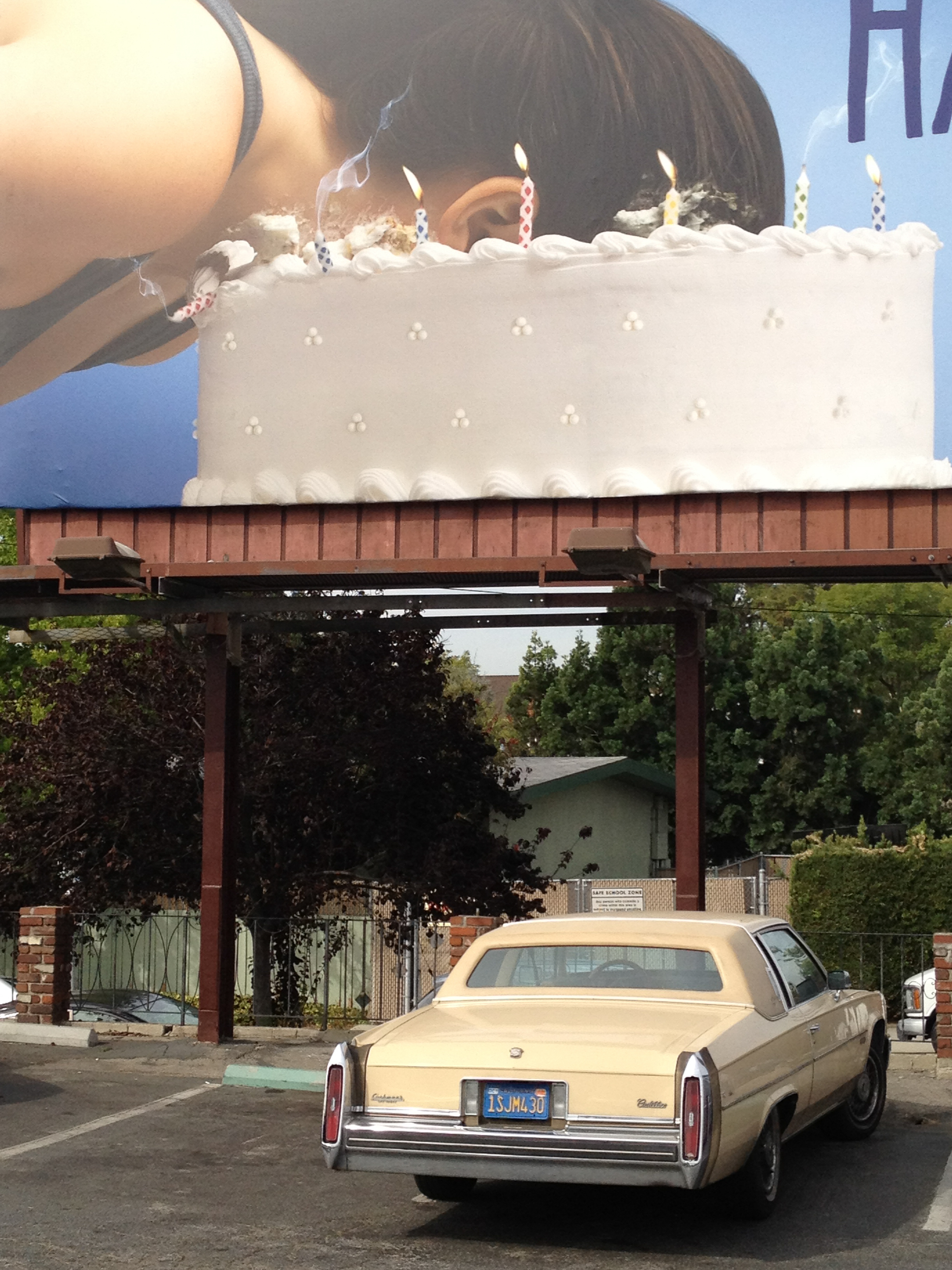
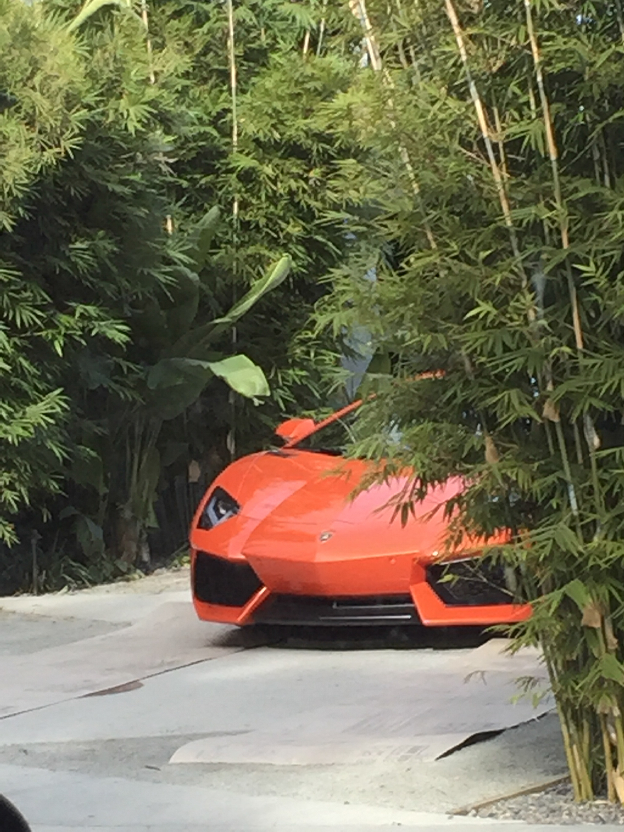
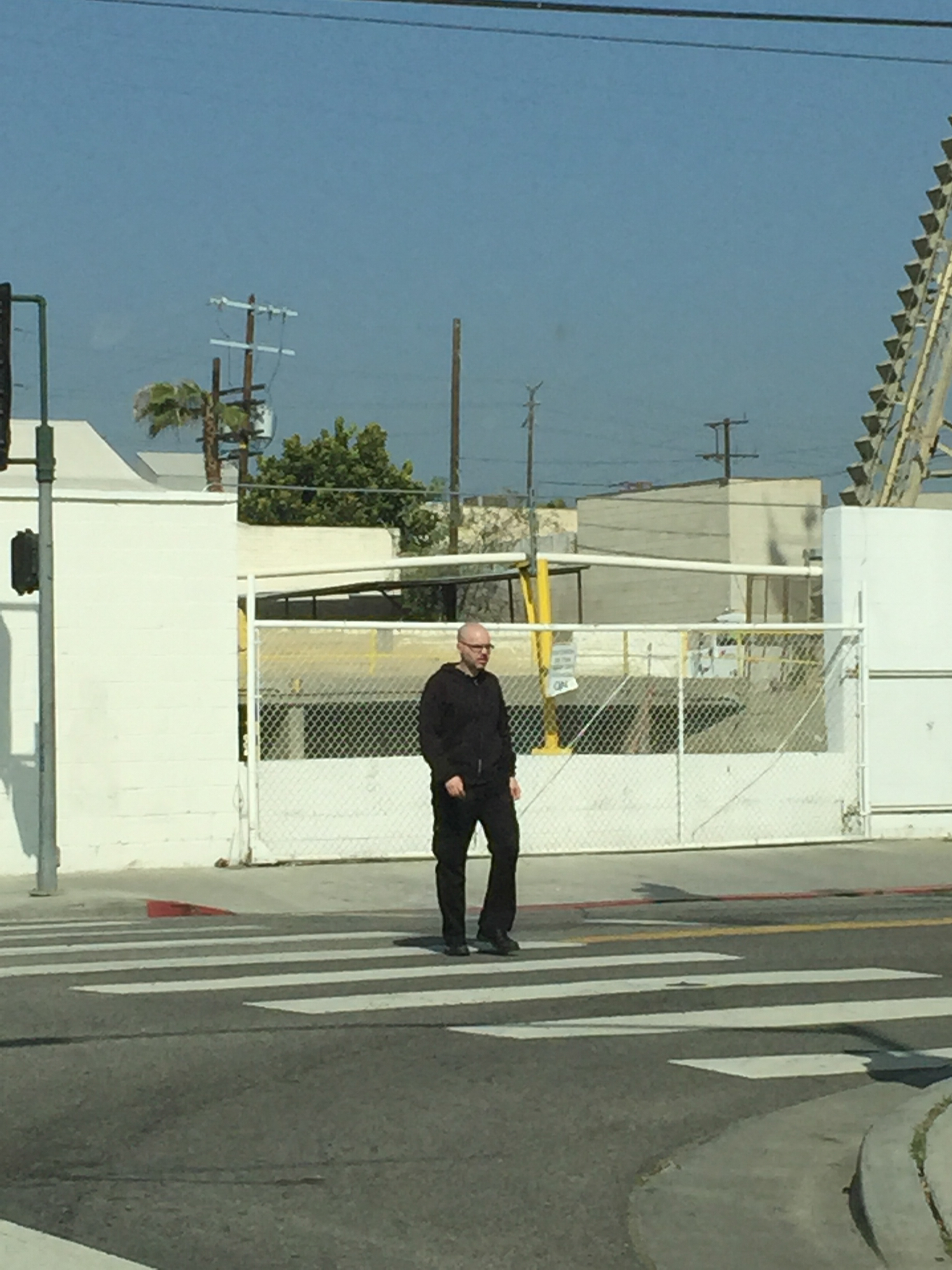
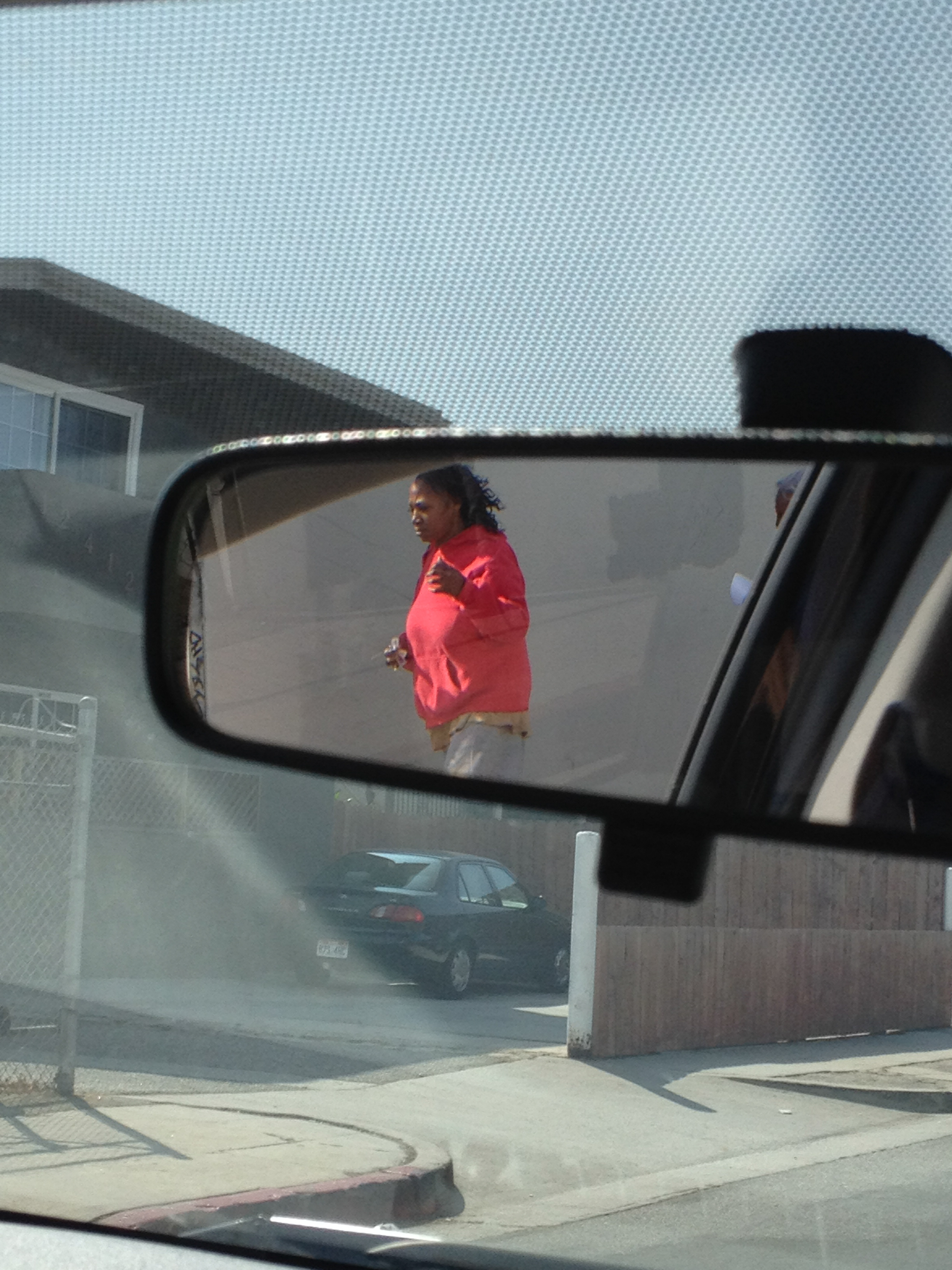
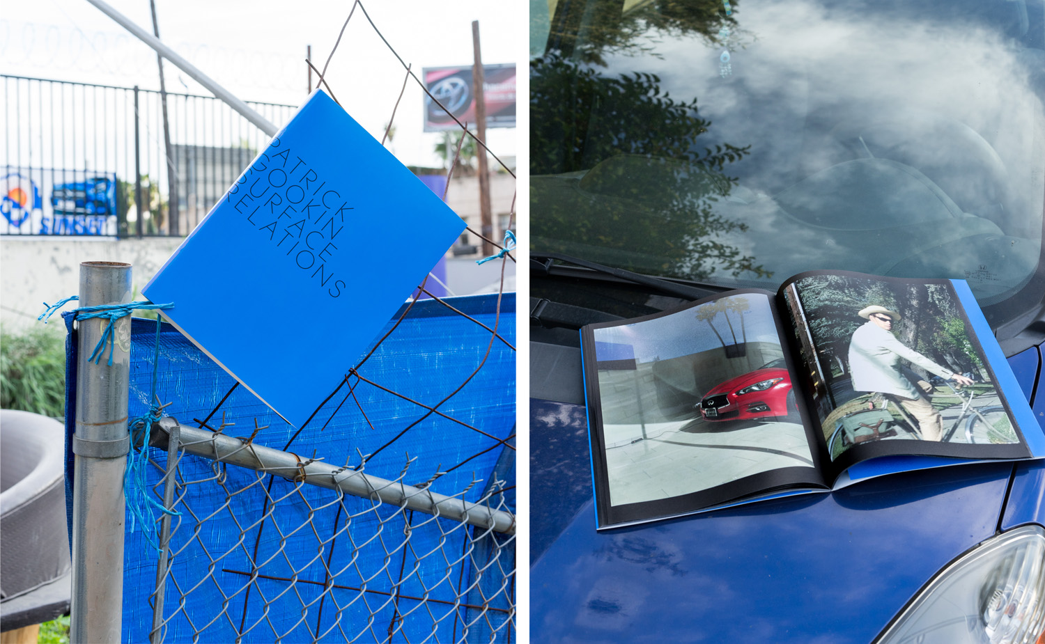
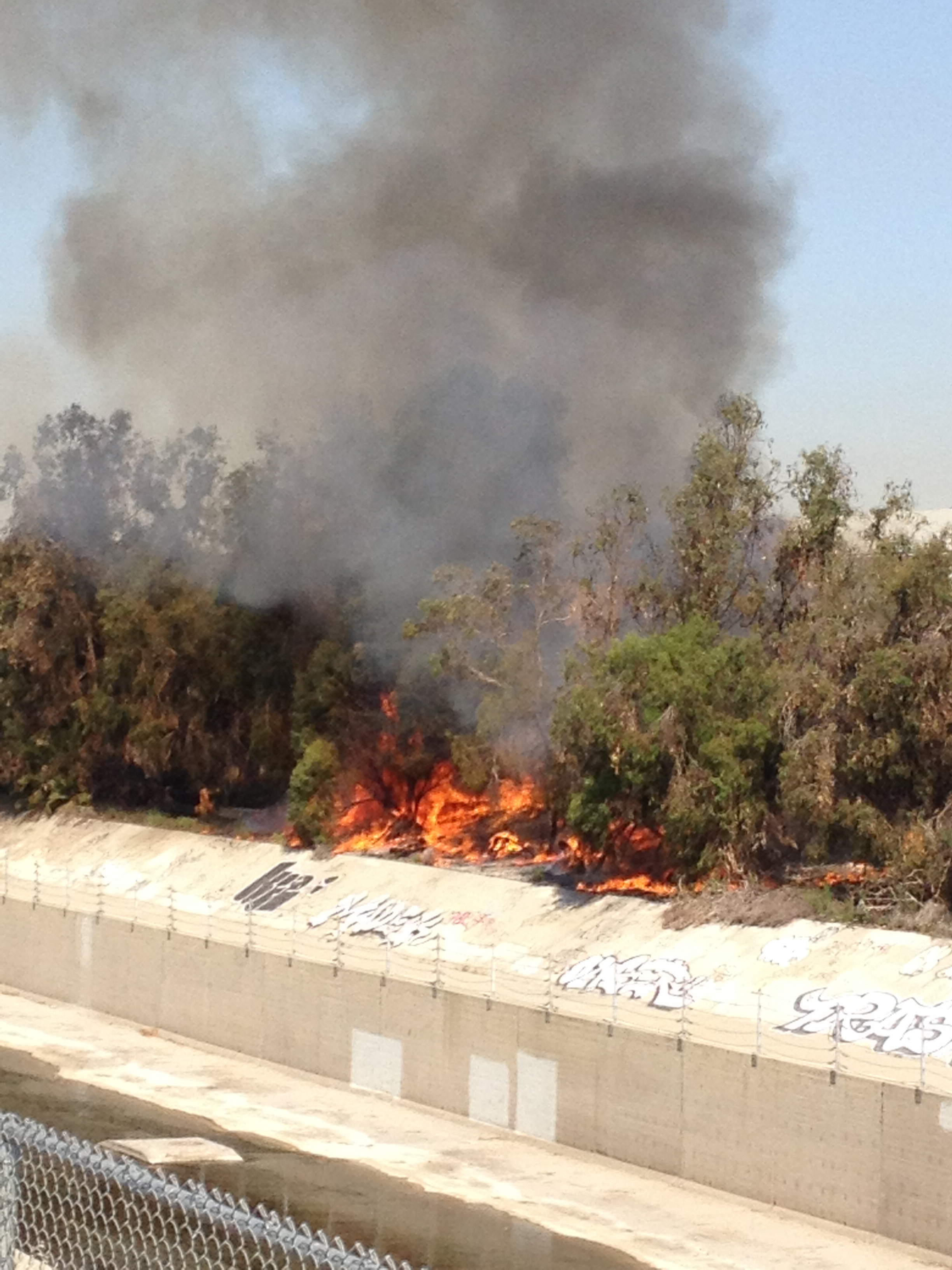
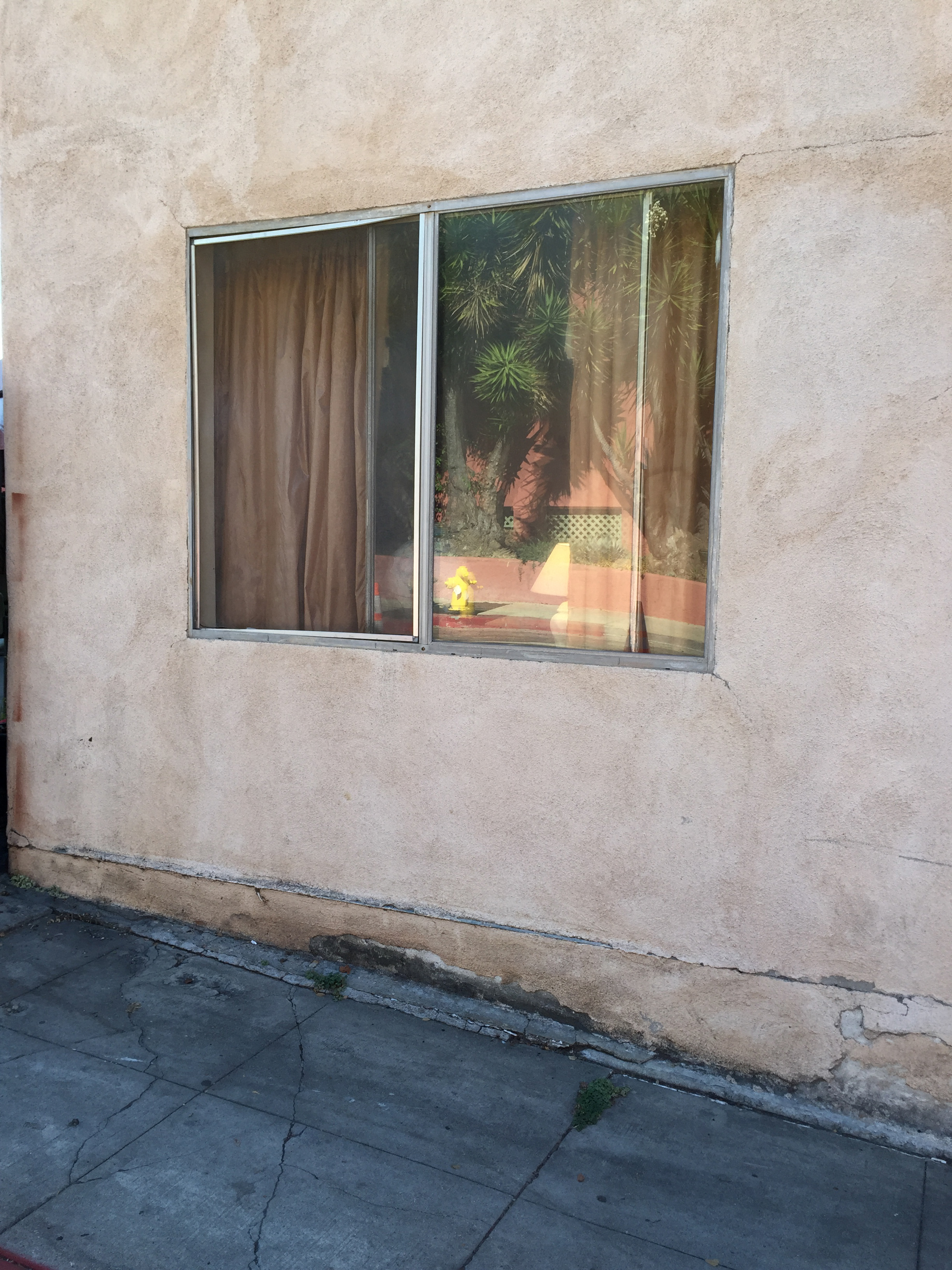
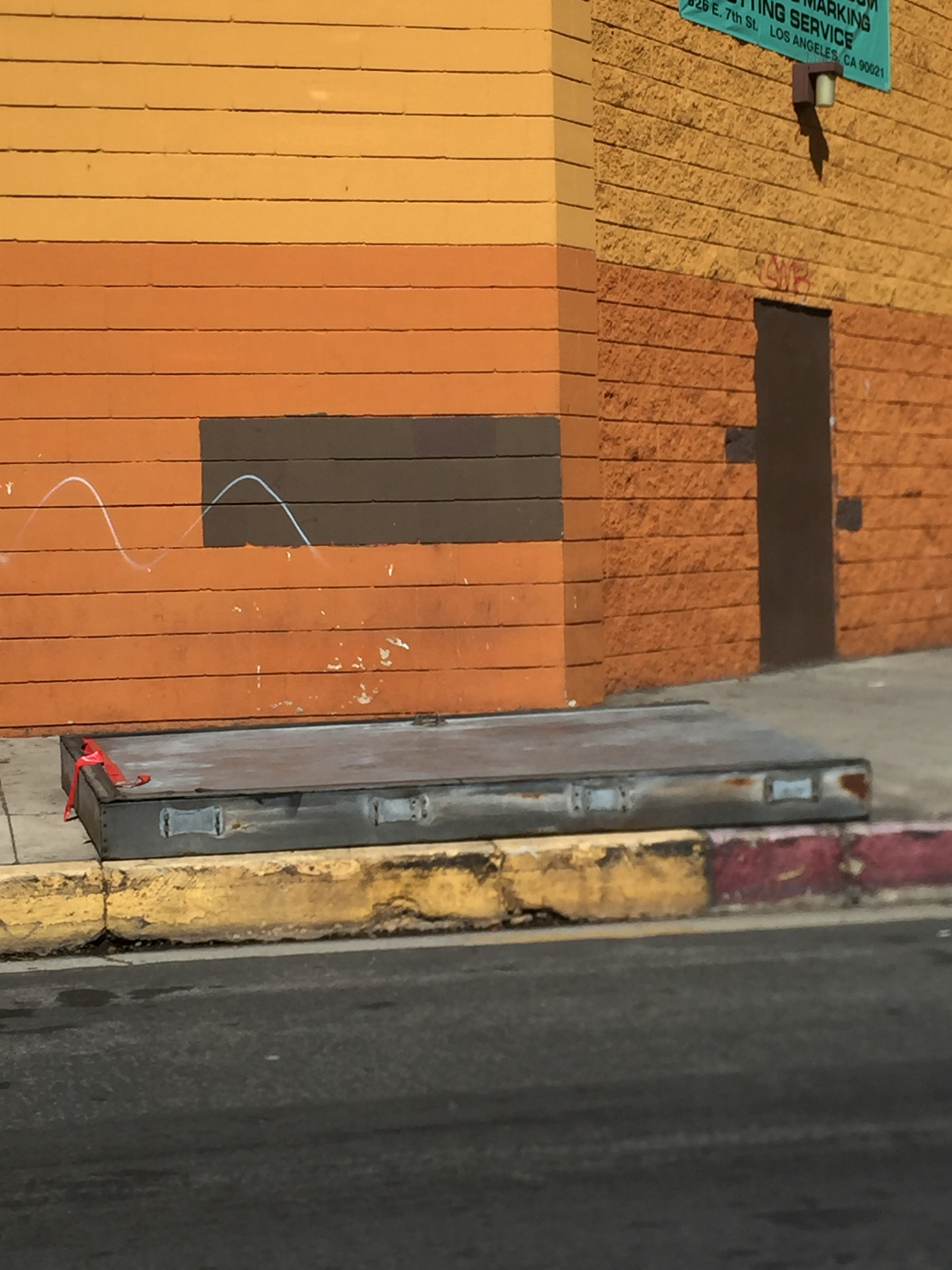
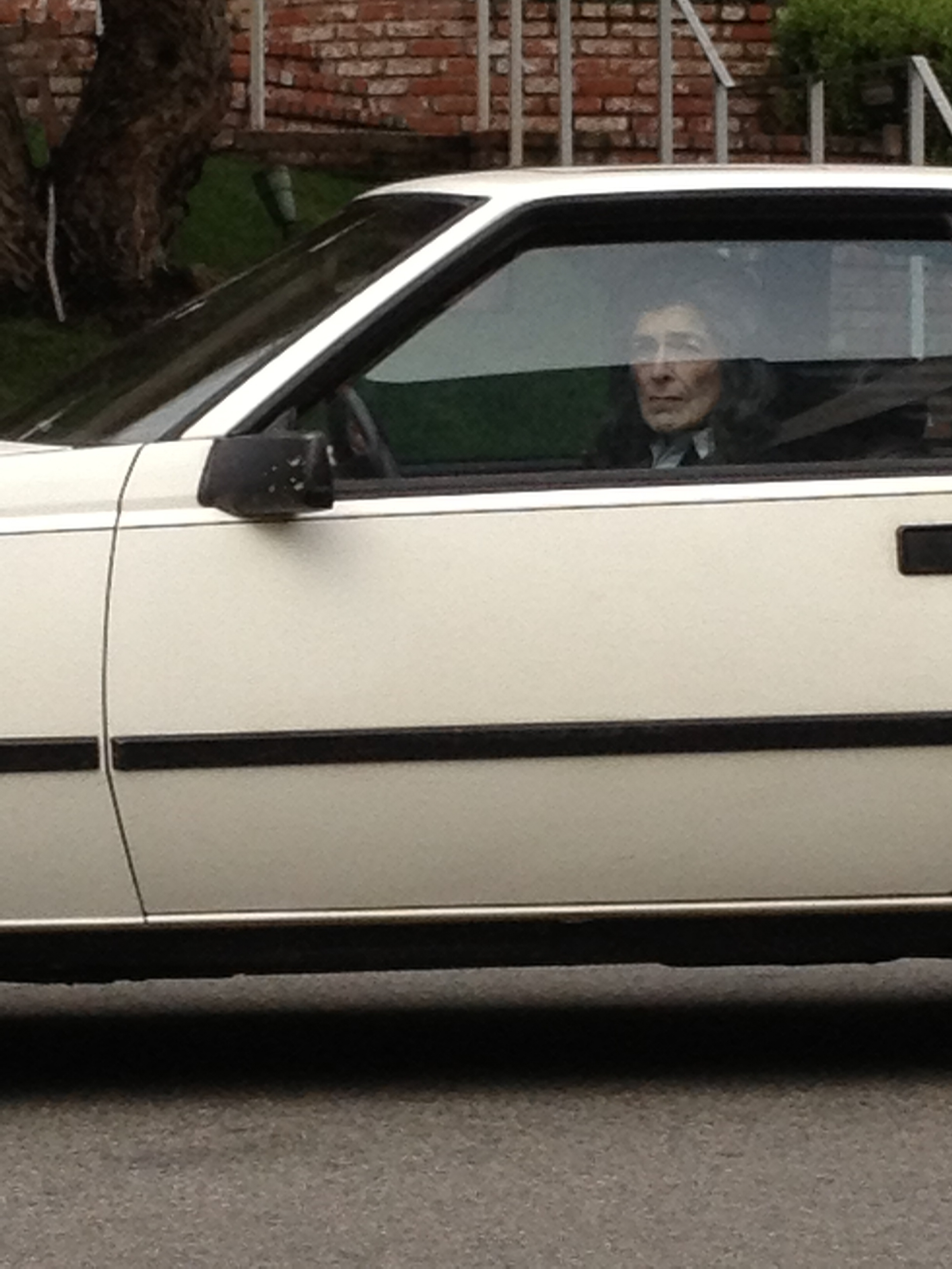
Surface Relations, a new photobook by Patrick Gookin turns Los Angeles' clichés into low-fi dreamscapes. Isolation in sunlight, failed ambitions, smoggy strip malls, commuters trapped in their cars, and billboards juxtaposed with sulking trees provide a pastiche of ongoing trepidation. Using various i-Phones, often shooting from the safety of his car, Gookin photographs anonymously as he passes through, his frame tangled, at times out of focus, nodding equally to the influence Lee Friedlander, as to the ever-present Google-cam. I've been drawn to Gookin's work since including it in Humble's 2014 online exhibition Tough Turf: New Directions in Street Photography, and have been following its evolution since. I recently spoke with Gookin about his book, LA car culture, and a hint of existential relationships. PS - for our friends in Brooklyn, NY, Gookin will be having a book signing and one-day exhibition at Sunday Takeout, this Sat, April 1st from 1-5pm.
© Patrick Gookin
Jon Feinstein: Last time we got together, you had just completed your first book, LA By Car. On the surface, I see a lot of similarities, but something feels subtly different.
Patrick Gookin: About half of the pictures in Surface Relations were actually made prior to LA By Car, and served as a sort of source material for pictures that I actively staged in making that body of work. In constructing those images I was spending more time thinking about the landscape, and LA in particular--the way that the automotive landscape shapes the experience of both the pedestrian and the person driving through, and so with newfound curiosity towards LA itself, I went back to making un-staged street and landscape images that ultimately became Surface Relations. Many of the pictures in both of the books deal with a sort of isolation and displacement relevant to both the pedestrian and driver's experience in Los Angeles, but this time around I became more concerned with the materials that the landscape was built of, and on, and LA's aesthetics as a city.
Feinstein: Have your ideas about LA, its car culture and sprawl shifted as you've worked on this project?
Gookin: LA is enormous and its size never ceases to surprise me. I've spent a lot of time driving around Los Angeles by myself and have come to appreciate the stillness of those wide streets during the early morning hours. LA still looks as alien as ever.
© Patrick Gookin
Feinstein: I see a nod/ dialogue with with classic street photography, and artists like Doug Rickard and Mishka Henner who have worked with google maps/ street view. Do you agree?
Gookin: Certainly. Rickard’s street view aesthetic was influential to me both in the feeling of pictures made by a roving camera and the lo-fidelity of digital surveillance technologies. It’d be hard to deny the presence of classic street photography in here, as I “grew up on” Winogrand and Friedlander, but mostly I was looking at Anthony Hernandez’s LA street work made in the late 70s and 80s (Public Use Areas, Public Transit Areas, and Automotive Landscapes) as well as the work he made about landscapes and materials later in his life.
© Patrick Gookin
Feinstein: The gestures and body language of many of the people in your photographs is often heavy, contemplative or existential, but almost always blurry an unrecognizable. How do you think this ties into your overarching narrative?
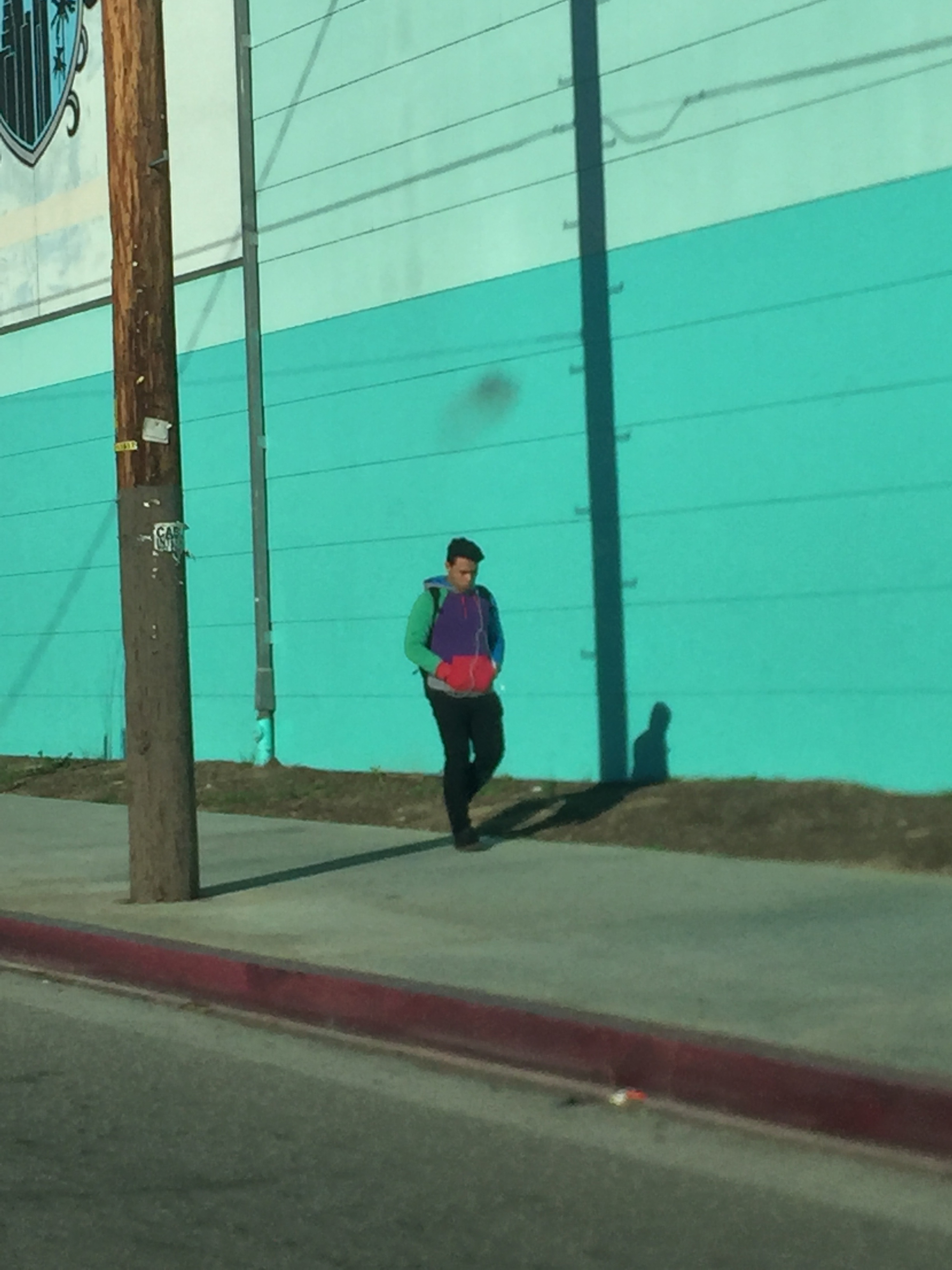
Gookin: Rather than looking into the lives of strangers I'm trying to make photographs about the distances between strangers, the coldness of public spaces in cities like Los Angeles, and what it looks like to pass through a city in an automobile. I think Los Angeles is unique in that it's been built with cars in mind rather that pedestrians. There's a feeling of isolation in traveling across the very large city in a car.
On the contrary, when traveling LA's wide streets with their narrow, sparsely populated sidewalks and big empty spaces on foot one is more openly exposed to others than they would be in pedestrian friendly cities such as New York or Tokyo. In many parts of Los Angeles pedestrians appear to be out of place, as if walking the streets in itself is in conflict with the landscape. Years ago, Karl Baden said to me in an email that the work had a sense of "existential isolation" and I believe that quality is the sum of those parts. The heaviness of the gestures is intended to emphasize that sense.
© Patrick Gookin
Feinstein: You took a kind of unconventional approach to the printing -- glossy cover, almost folder-style with matte- newsprint-y pages. It's slick, but also references low-fi processes, kind of like the images themselves. Can you talk a bit about this decision?
Gookin: These pictures were made on an iPhone (or 4 different ones) and there was a deliberate intent to print them large enough to highlight their flaws and inconsistencies, and to use a paper that felt un-precious and somewhat utilitarian (much like a digital snapshot), but still beautiful in an ephemeral kind of way. Are iPhone pictures cheap and tacky, or important to the future of photography? Is Los Angeles a plastic polluted wasteland, or should it taken seriously as the future model of American cities? These are questions that I was interested in--stereotypes that I wanted to play with. The shiny blue cover contrasts the warm feeling of the paper. It's cold and technological, referencing digital screens and a futuristic modernism present in Los Angeles that is very much part of both the topographical and social landscape here.
© Patrick Gookin
© Patrick Gookin
Feinstein: What's behind the title "Surface Relations"?
Gookin: Most simply it’s about these surface level relationships that one has with people and the landscape in Los Angeles as she is passing through it in a car. That's what I was attempting to photograph in making this body of work. Surface is also a reference to surface streets--a uniquely LA phrase that refers to the network of city streets outside of the freeway system--from which most of these pictures were made. Lastly, its a call-back to American Surfaces as I've embraced the iPhone as a picture making device much like Stephen Shore embraced 35mm color photography in making that work, long before such approach was allowed to be considered art, or even photography at all.
Feinstein: Aside from the title, there are no words with these pictures. What's this all about?
Gookin: I’m interested in how pictures operate without the aid of words, without context imposed on them, and how photobooks can work on purely visual terms. I hope that the viewing experience of the book resembles both the way in which we absorb the endless flow of images on our screens, and the way in which one can encounter an unfamiliar place.
© Patrick Gookin
Feinstein: Who designed the book? How did you decided to work with them?
Gookin: The photographs were made over a 5 year period, 2012-2016, and the initial editing process began with a collection of over 20,000 images. I made a digital dummy last Winter that I started to send around to friends for feedback and what I learned mostly was that a lot of my image pairings were read too easily, and that I was not a very good book designer. At that point I reached out to Niall Sweeney at Pony Ltd who I had heard about through Eamonn Doyle's Dublin trilogy of photobooks, which I was a fan of--the photos themselves, but also the books as objects and their strong design. Niall was quick to respond, and we started working together shortly thereafter. We re-started the editing process with a much smaller batch of images and worked together through email over the course of a few months. Some of my original spreads stayed in tact, but for the most part Niall was able to find pairings that felt less on-the-nose, and created a sense of momentum as more obviously related pictures were given more space between each other.
Feinstein: Congrats on getting into Hartford Art School's Limited Residency MFA! What do you hope to come of it?
Gookin: I’m invested in continuing to learn how to see and how to read pictures. 90% of my engagement with photography and art communities happens online, so I'm also hoping to find a supportive community of teachers and peers who I can both be pushed by and held accountable by. I want to commit myself to my practice more deeply than I've been able to in the past and the pursuit of an MFA in photography seems to be a way to do exactly that.
Editor's Update: the following question was added a day after the original post:
Feinstein: Strange that I didn't catch this at first since I've been a fan of her work, but I noticed a couple images from your early series seem to nod to Lisa Sarfati's work, one image almost identical. Time Lightbox featured some of Safarti's images back in 2012. Since yesterday, a few of our readers dived into your work reached out to me about the connection. Is there a conscious reference in your work?
Gookin: Yes, she was a big deal to me in general while I was making LA by Car and one of the pictures in the book was a re-creation of one of hers (same location, same gesture, similar wardrobe). The other photos that were referenced were by more canonical figures-- Jeff Wall, Gregory Crewdson and Weegee, and were a bit less spot on. Strangely, I caught a glimpse of her yet to be published new book, Oh-Man by Steidl yesterday and the connection between our work only seems to have gotten more apparent.
© Patrick Gookin
© Patrick Gookin
© Patrick Gookin
© Patrick Gookin
Bio: Born near Boston in 1983, Patrick Gookin graduated from Emerson College in 2006 and has spent the eleven years since split between Los Angeles and Tokyo. He works as a commercial and editorial photographer. His work has appeared in numerous group shows in California. Patrick’s first self-published photobook, LA By Car, was released in 2014. Much of his work is made on and about the Los Angeles landscape.

