Visit Mark Peterson's Website for more great work.
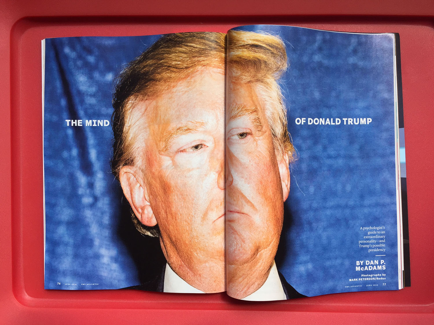
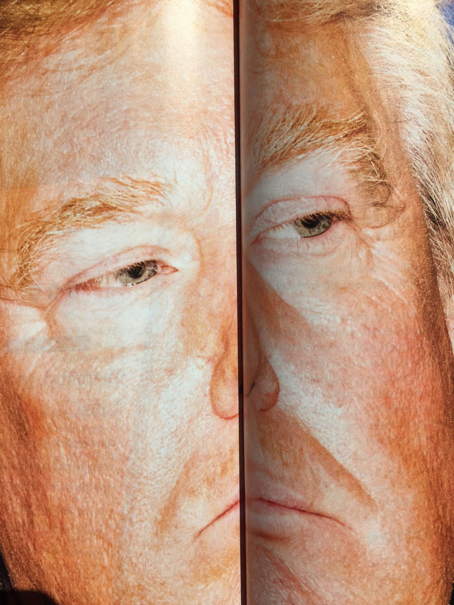
You won't get to appreciate this on the tablet or mobile versions in the same way, but if you get your hands on a copy of the print edition of the June issue of The Atlantic, you'll encounter one of the visually smartest spreads about two-thirds into the magazine. The article explores The Mind of Donald Trump via a psychologist's guide to his absurd and complex personality. We're awe-struck by the heightened visual literacy in the decision to place Mark Peterson's photograph of Donald Trump across two pages, splitting his face across its gutter. While designers are technically supposed to avoid this at all costs, we think it's pretty well done. Detail shot below!


