© Michael Marcelle
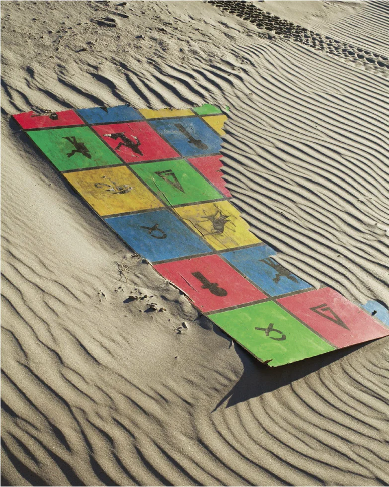
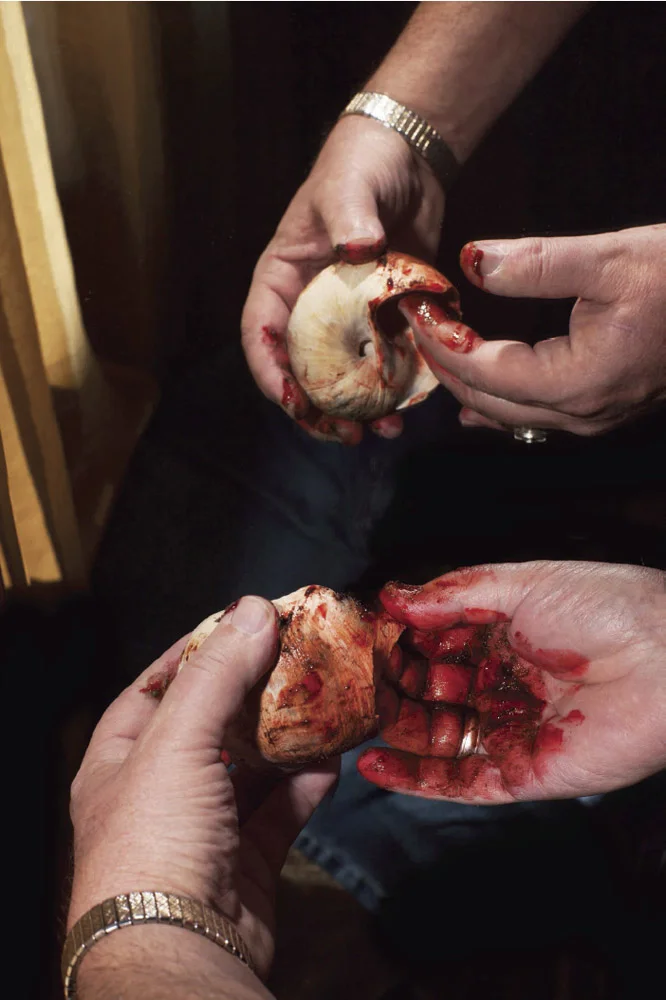
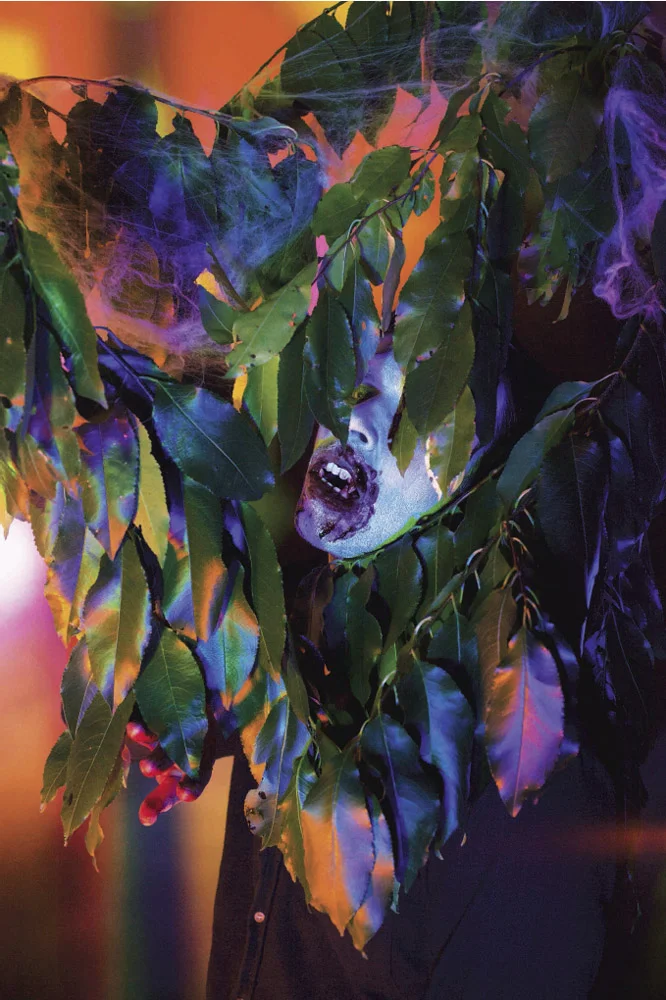
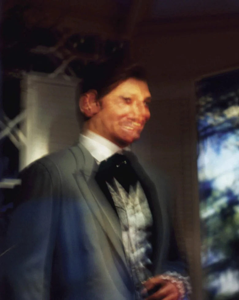
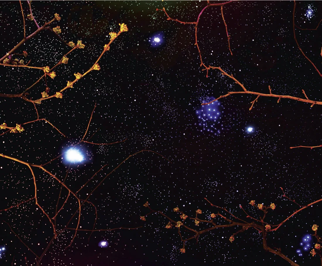
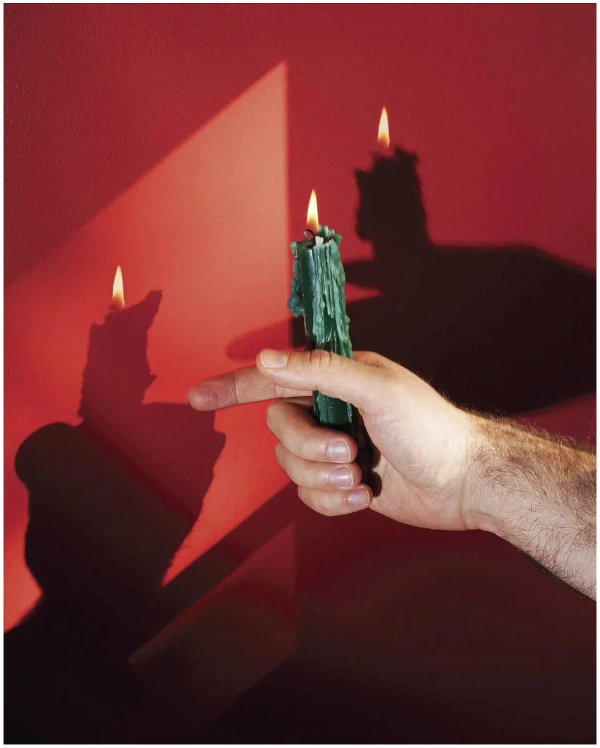
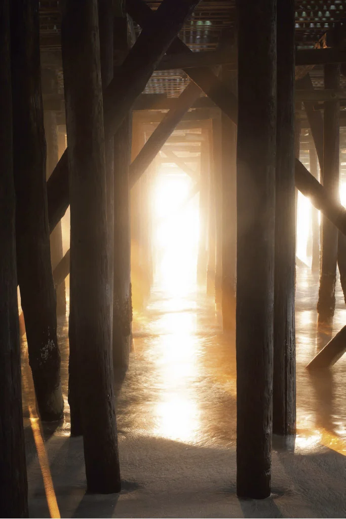
"When I was a child," writes Michael Marcelle in the forward to his upcoming monograph Kokomo, I thought there were monsters on the beach, waiting beneath the dunes, between the reeds. I would walk along the shore with my family, looking over my shoulder for a sign..." In 2012, Hurricane Sandy swept these dunes away, destroying Marcelle's memories of his hometown on the Jersey Shore. Already into his career as an art and editorial photographer, the devastation the storm caused to his childhood memories floated into his work, a series of photographs that lie somewhere between memoir and science fiction.
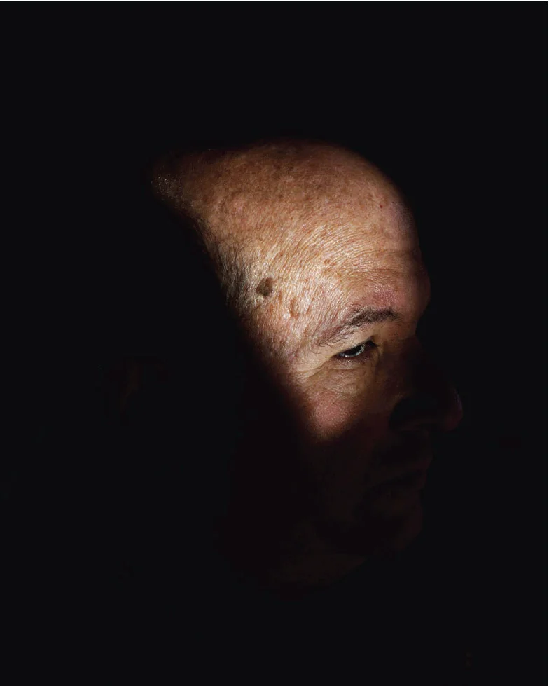
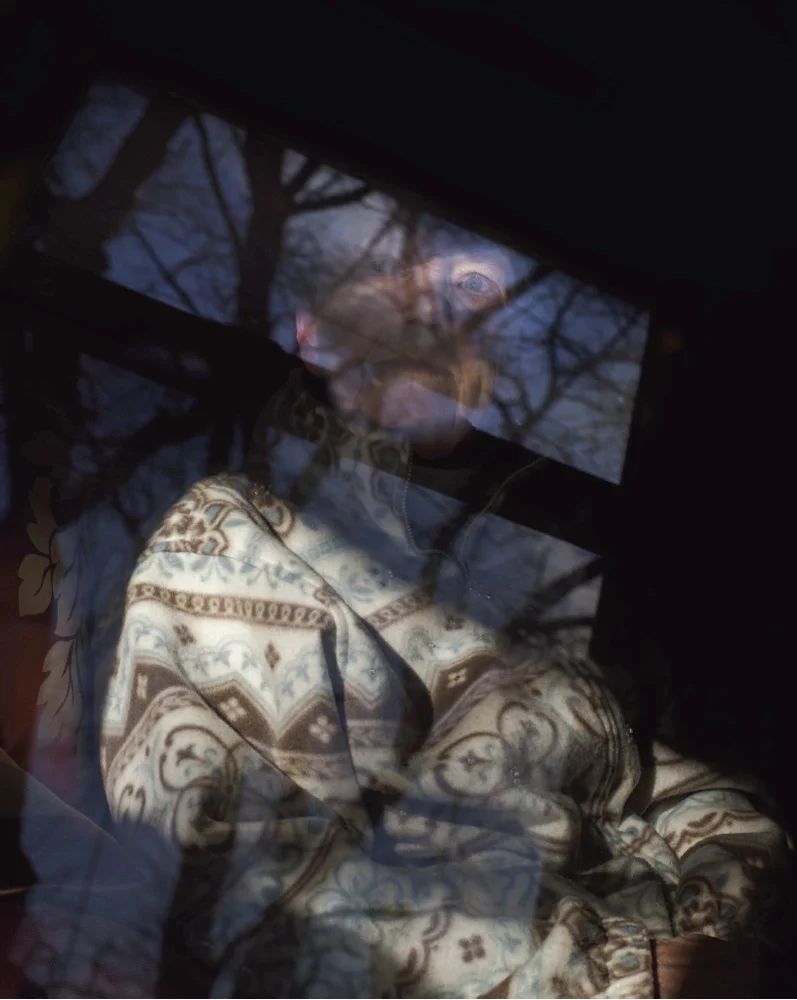
While many photographers at the time covered the storm's destroyed landscape with an opportunistic or documentary lens, Marcelle folded its consequence inward. "The subjects are my immediate family," writes Marcelle, "caught in states of transformation and mutation in a ruptured, alien landscape." He recently teamed up with photography wunderkind Matthew Leifheit to publish the work under Leifheit's new imprint: Matte Publications, and they've launched a Kickstarter to help fund it. In advance of the campaign, I spoke with Marcelle about his obsession with horror and its metaphor in his work. Make sure to watch the video at the end of the interview to learn more.
© Michael Marcelle
Jon Feinstein: Since leaving Bard, your work went from formal, large format, Stephen Shore landscapes to cryptic, horror-fantasies. How did your "seeing" evolve over the years?
Michael Marcelle: What clicked for me was focusing on the things that really interested me on a deep level, and putting them front and center into the work. Early in my career I used to reference the aesthetics of horror and spectacle a lot (I think probably in a Humble interview!), but I think there was a disconnect between what I was saying and what was in the work. When I got to Yale I started to make the kind of work that I wanted to look at, which is generally very intense, hallucinatory, and unsettling.
© Michael Marcelle
JF: Yes! I think we did that interview right before you went to Yale. I loved your work then, but it's come a long way.
MM: Another aspect of that shift was switching to a digital camera, which allowed me to experiment with the kind of practical special effects that have become a cornerstone of my process. When I was using 4x5, I could only take maybe 3 photos of whatever I was shooting because it was so expensive, and then I’d have to wait days to see the results. Digital has freed me in ways that I never really thought possible, and allowed me create new kinds of pictures.
I think there’s a certain sway right now towards using analog technology in fine art photography, as a way to maybe counteract the speed that visual culture enters our lives, to try to slow things down and make sense of the world. I like to think of my work as utterly digital; as contributing to that sense of disorientation and unease that we’re so steeped in.
© Michael Marcelle
JF: Your family has an active role in so many of these photographs. How do you work with them/ direct them/ etc? How much are these pictures autobiographical vs something else?
MM: Very carefully! No, they were amazing to work with, and this project is entirely indebted to their patience with my insane demands. It’s been a very collaborative process, and I try to let them in as much as possible to creating these pictures.
It’s also important to acknowledge that it was an incredibly overwrought, emotional, and at times difficult experience. This work is about a family coming to terms with not only the trauma from a natural disaster, but also facing death and mortality square in the face. It’s about aging and loss - it’s about coming home and finding everything changed.
© Michael Marcelle
JF: You often describe your work as having a "queer aesthetic " -- queerness as a metaphor or alternate world. Can you elaborate on this?
MM: There’s a (very complex and relevant) history of work made by men who identify as queer that’s related to ideas of the body and desire. However, I’m interested in the body as a point of repulsion, as something that becomes inverted and uncanny through photography. I often look at the works of pioneering queer artists like Kenneth Anger and James Bidgood, who translated queer desire - and the oppression from a homophobic culture - into oblique, occult fantasy worlds. It becomes less about the body and attraction (though there’s still plenty of that in their work) and more about manifesting a queer consciousness…what would a queer world look like?
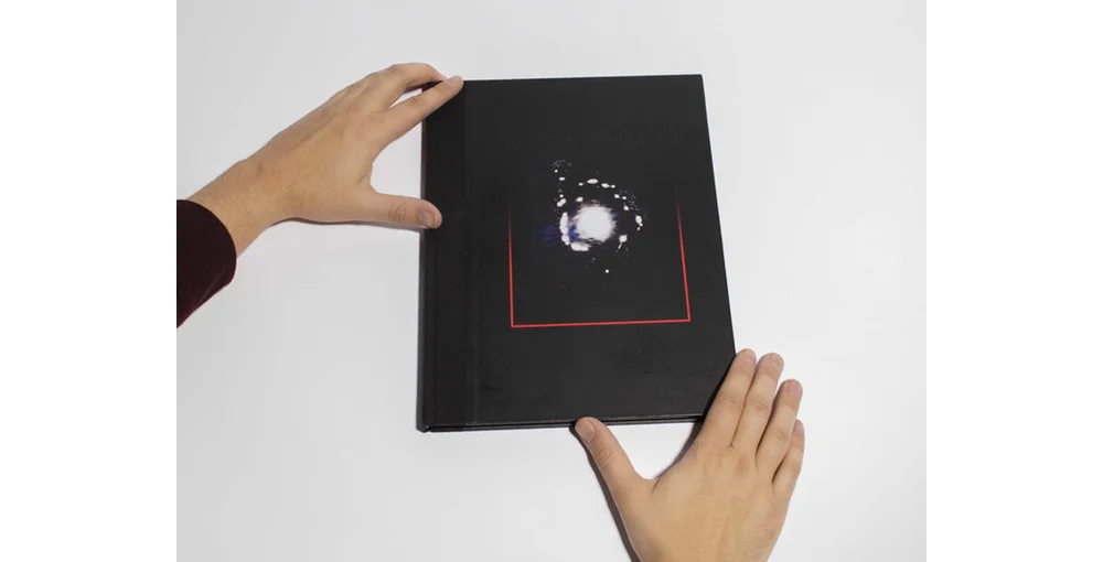
JF: The Time-Life book covers that you're basing the cover/design on are crazy and mysterious. I think I actually have a Russian translated version of one of them that I found in a used bookstore here in Seattle a few years ago. What drew you to riffing on their design?
MM: The Time Life Mysteries of the Unknown books were deeply terrifying to me as a child. Reading them was one of the first times that aliens and hauntings and psychics were presented to me in such matter-of-fact and allegedly true terms. But they were also over-sized hardcover books, so they still sort of felt like children's book. I would borrow them from the library and then they'd sit in the corner of my room, and I'd have to dare myself to even touch them, let alone read them. The cover design is like some bizarre unholy book from another dimension, like a Necronomicon. It felt like the perfect homage to designKokomo in a roughly similar way.
© Michael Marcelle
JF: I hear you also still have a stack of Fangoria magazines from your childhood. Can you tell me a bit about how these fuel new ideas in your work?
MM: Fangoria basically acts a mood board for me in the studio, whenever I’m stuck on an idea. I also have a deck of old horror trading cards that I’ll sometimes deal out to myself like an obnoxious version of Oblique Strategies, or a really trashy version of tarot cards. The answer is usually always darker and more gore.
I’m also incredibly interested in pre-CGI practical special effects, and try to use a lot of the same techniques used in b-grade horror films in my work. There’s something incredibly beautiful and touching about special effects that show their seams.
© Michael Marcelle
JF: There's been a LOT of attention lately to 80's and 90's nostalgia... most notably with Stranger Things, but it's all around. Has this impacted your work in any way ?
MM: On a basic level, Kokomo is referencing more of an outsider shlock interpretation of 80's horror, whereas Stranger Things seems interested in a warmer, Amblin Entertainment kind of a vibe.
It's very appropriate that you mention "nostalgia", because I often think of these photographs as being totally overwrought with a uncanny interpretation of nostalgia, where nostalgia is ultimately the same thing as death.
© Michael Marcelle
JF: If you could be the on-set photographer for one horror or sci-fi movie of all time, what would it be?
MM: I would make my own.
JF: Ok, If you could collaborate with on horror legend, who would it be?
MM: Stephen King in 1985
It's been interesting to see your editorial work, which is so close to your personal work. What's it like shooting on assignment?
Doing my own work can often feel a little hermetic and isolating, and it can be really helpful to work with an editor on a specific set of goals. I prefer when the editor takes a hands-on approach and it becomes a very collaborative process, and I’ve been lucky to work with a lot of editors like that. People like Siobhan Bohnacker at the New Yorker and Elizabeth Renstrom at Vice will come to me with a story and an idea, and we’ll work together to find the right picture.
© Michael Marcelle
© Michael Marcelle
JF: I'm excited to see this in book form. Tell me a bit about the collaboration with Matthew Leifheit and the decision to self-publish.
MM: I had met with some really great people who were excited about the project very early, but MATTE Editions was always at the back of my mind. I’ve known Matt for years and we’re close friends, and I really admire Matte Editions (not to mention the magazine, his photography, his films...the list goes on! ), and he’s been a big supporter of this project for a long time.
It's kind of the perfect scenario where we can not only release a book that we're both very excited about on our own terms, but also to set a tone for future MATTE Editions books, rather than working with a bigger publisher and latching onto their established vibe.


