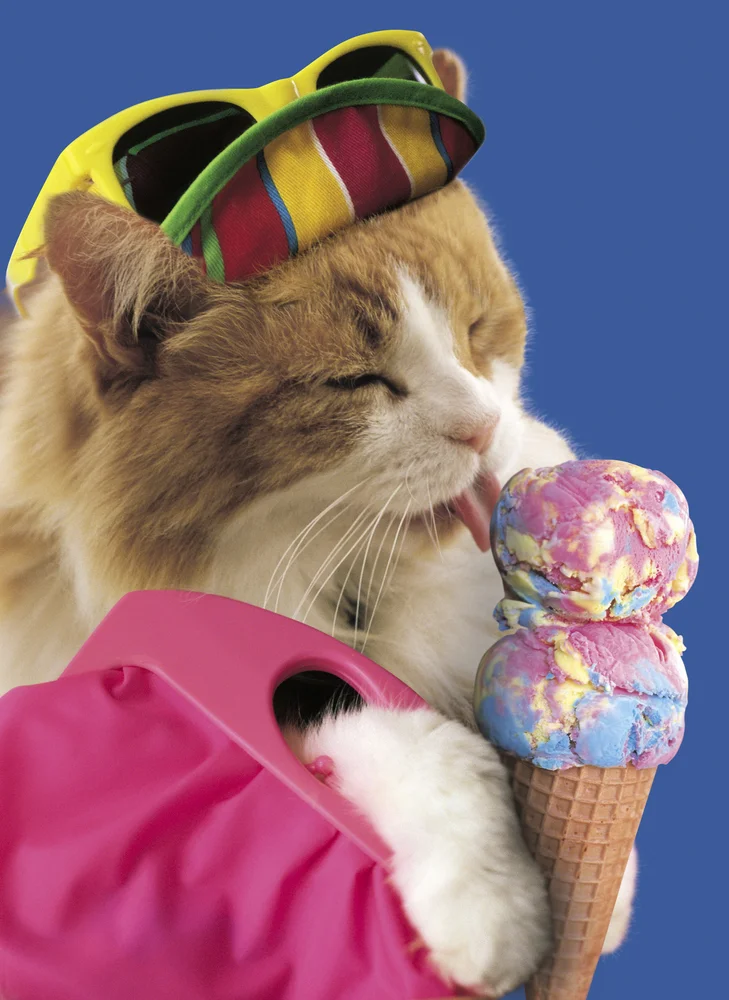
Click-bait continues to be one of the emptiest forms of online pseudo-journalism. Easy headlines full of hollow adjectives goad readers to spend their attention on an endless cycle of content. While these words often lead to thoughtful material, they can pull us down a rabbit hole of a story that has little to do with its syrupy headline. This "and you'll never guess what happened next" form of new literature extends to art and photography journalism, and its motives are pretty transparent, but somehow we keep clicking, and here at Humble, are often guilty of using them ourselves. So we asked some of our favorite photography writers, curators, editors, historians and educators to dish out their most beloved click-bait pet peeves, which we illustrated with some of our favorite stock images of cats.
1) Vintage
Nothing bugs me more than the misuse of the word “vintage” in photography headlines. Vintage means something very specific in photography circles. It refers to a physical photograph that was made during the photographer’s earliest printing of the image. Things it does not mean: old-timey, black and white, sepia, out of focus, nostalgic, made before you were born, retro, faded, desaturated. I am on a crusade to bring the word “archival” into the vernacular.
Emily Shornick. Photo Editor, New York Magazine/ The Cut
2) "NSFW"
Go-to Urban Dictionary defines "Not suitable/safe for work” as content generally inappropriate for the workplace. If your workplace is in the art world, you have a lot of leeway. I look at photos of nudes on a regular basis (we recently featured Mona Kuhn, for example). But it seems in the photo blog world, NSFW has become the be-all, end-all attention-grabber. “Hey, check this out it’s totally NSFW” which translates to “click on this because you might see a naked lady.” Though NSFW is more of a tag or phrase, rather than a word to describe the images, it’s been overused and I think has caused our levels of taste to go downhill. I feel like it’s been the “word” to announce to the readers “hey, look at this, there may be pornographic photos in this post” instead of “hey, this is work you really need to see and read about.” Some artists, like Mona Kuhn, have accomplished both, but I feel like NSFW part of her work, is secondary to the project.
Amy Wolff. Photo Editor, PDN
3) Powerful
I keep a very optimistic view of photography on today’s Internet and honestly believe that taking a moment to view and appreciate a good photograph on your cell phone or laptop is healthy. But context is so critical to that exercise. That’s because language is tricky and photography is one the most complex of dialects. So using words like “powerful” to describe images that are less than that can be extremely irresponsible in that regard. If a photograph is described as “powerful” then it should contain a certain vitality in every aspect of that image (context, intent, composition, and execution), so that the picture screams insistently with punctum and burns deep in your mind’s eye until the next “powerful” photograph swipes across your screen.
Gabriel H. Sanchez, Photo Essay Editor, Buzzfeed
4) Should
The word "should" is evil. I suggest photography writers abolish it. Photographers you should know about. Cameras you should use. Books you should buy. Says who? Says someone who doesn't know you, yet presumes to anticipate your needs, then guilts you like a stubborn puppy into obedience? You should sit, Fido. Oh really? Well, maybe you should, and maybe you shouldn't. But that choice is completely up to you, not some silly writer. Fuck "should." Do what you want.
Blake Andrews. Photographer, Critic
5) Lyrical
I've always had a soft spot for the connection between photography and poetry or literature, so I'm completely guilty of this one but sometimes when I read it I cringe just a little bit.
Shane Lavalette. Photographer. Publisher/Editor, Lavalette. Director, Lightwork.
6) Incredible
Generalities like this are often used in hopes of getting web articles more traffic. If we say the photos are "incredible," maybe people will believe us and have to click and see for themselves. In truth, any photography content worth writing about would be better served by more specific descriptors—if the photos are incredible, what makes them so?
Matthew Leifheit. Founder, Matte Magazine. Photo Editor, Vice.
7) Liminal
Liminal is an over used descriptor that I've seen enough of. More than single words, I have been bothered by the tabloid-esque headlines on certain blogs to sensationalize projects. I feel it diminishes the work and feeds into the viral mentality, where work is gobbled up, spread around, and spit out, with no reward or meaningful outcome.
Aline Smithson. Photographer, Writer, Founder, Lenscratch
8) Stunning
When words are overused they begin to lose their meaning and people stop paying attention. It's really easy to use words such as 'stunning,' 'magical', and 'amazing' when describing photography and art in general (you see it all over the web), but it's also pretty lazy. One of my writers was going a bit crazy with the use of 'poignant' so we've taken a bit of a break from using that word too.
Alison Zavos. Founder/ Editor in Chief, Featureshoot
9) Haunting
Photos are a vision of the past. So, among the many things they are, they are ghosts. However, due to the lazy overuse of the word, ‘Haunting' doesn’t apply anymore. A key characteristic of the photographic medium has been slowly and silently eradicated because of our lack of invention. Alongside ‘Stunning’ ‘Awesome’ and ‘Epic’, ‘Haunting' is a word that carries no meaning in photography any more. It’s a turn off. And it’s a hard sell. I reserve similar contempt for the adjectives ‘Eerie’ and ’Surreal.’ The real shame is that these formulas are almost unavoidable in publishing these days. I’m guilty. Stories I’ve written have been published under headlines that have included the words ‘Stunning’ ‘Awesome’ ‘Epic’ ‘Eerie’ and ’Surreal’. And, yes, ‘Haunting’ too.
Pete Brook. Writer and Curator. Prison Photography
10) Content
Sure, it’s used ad nauseam within the media production world, but extending it to phrases like “the content of the photo is interesting” or “the dance has such great content” is such an empty catch-all that makes me want to gag. I was at the laundromat the other day and caught a few minutes of Dancing with the Stars and one of the judges kept repeating the word over and over. It was obvious she didn’t have a clue about dance technique. A photograph may have interesting lighting, subject matter, composition, tonal range — but not content.
Lindsay Comstock. Writer and Photographer.
11) Quiet // Quirky
It’s hard to imagine any declarative adjective, specifically in headlines, that aren’t overused in online publishing. They lend themselves to one of the more annoying group of words found in the comment section of posts: How is___. In other words, no matter what you write, your words will never back up the high bar you set for the photographs. Two words I – and many of my colleagues - overuse are "quiet" and "quirky." Perhaps we all need to be a bit more subtle or astute when writing about the unconventional or idiosyncratic.
David Rosenberg. Editor, Slate's Behold Blog
12) Iconic
A Twitter search for "iconic @johnedwinmason" turns up an embarrassing number of hits. Like so many other people, I use "iconic" in an attempt to rise above the clutter of social media, when I really mean "famous" or "made a long time ago" or "a picture I happen to like a lot and you should, too." But even when I use "iconic" properly -- for photos of great cultural significance -- I still have problems. "Iconic" for whom? When? And why?
Here's an example. When Gordon Parks first wrote about his photo “American Gothic” his iconic (yes) portrait of Ella Watson in a 1965 memoir, it embarrassed him. He called it was "unsubtle" and admitted that he "overdid it." By the time he published his last autobiography, in 2005, he described it with pride as an image that told uncomfortable truths about America. "Its existence," he said, "was already intertwined with the future."
What had happened between 1965 and 2005? Simply put, the portrait had become something it wasn't in 1965 -- iconic. Why had its status changed so radically? Parks had achieved recognition as a great artist. Just as importantly, American was now ready to accept the portrait's message. The photo hadn't changed. Parks and America had.
There's probably nothing we can do to stop "iconic" from marching on, carrying less and less meaning as it goes. I'll undoubtedly use it again. When I do, you have my permission to make fun of me if I get it wrong.
John Edwin Mason, Writer, Photographer and Historian.


